


The Intensity Map has a few of the interesting characteristics of the Geo Map and some special features of its own. Keep reading to find out more!
In this TechTip, I'll present a new API and two examples with real data, the first with international information and the second with U.S. info per state. While the Geo Map chart allows a certain degree of interactivity and flexibility, it also has some limitations; it's Flash-based and doesn't allow the simultaneous display of different types of data, just to name two. The Intensity Map chart overcomes some of those limitations, even though it has some of its own. I'll explain more about this type of chart with the help of two examples later on this TechTip.
The template used to generate the HTML file that in turn creates the chart on your browser will be the starting point of the exploration of this API. As usual, I really recommend that you read all the previous TechTips of this series, starting with the first one, as well as the Intensity Map documentation, because each TechTip highlights an area or detail of the process of generating the charts, and the API's documentation is usually clear and complete. Even though all the chart types are somewhat similar, each of them has its uniqueness.
Let's start by reviewing the IntMap.tmpl template:
/$Header
<!DOCTYPE html PUBLIC "-//W3C//DTD XHTML 1.0 Strict//EN" "http://www.w3.org/TR/xhtml1/DTD/xhtml1-strict.dtd">
<html xmlns="http://www.w3.org/1999/xhtml">
<head>
<meta http-equiv="content-type" content="text/html; charset=utf-8"/>
<title>
/%PageTitle%/
</title>
<script type="text/javascript" src="http://www.google.com/jsapi"></script>
<script type="text/javascript">
google.load('visualization', '1', {packages: ['intensitymap']});
</script>
<script type="text/javascript">
function drawVisualization() {
// Create and populate the data table.
var data = new google.visualization.DataTable();
data.addRows(/%TotalRows%/);
data.addColumn('string', 'Country');
/$Column
data.addColumn('number', '/%ColumnTitle%/');
/$FirstRow
data.setValue(/%RowNbr%/, 0, '/%RowTitle%/');
/$Row
data.setValue(/%RowNbr%/, /%ColNbr%/, /%CellValue%/);
/$OptionsBegin
var options = {
/$Option
'/%OptionTitle%/': /%OptionValue%/
/$OptionsEnd
};
/$Footer
// Create and draw the visualization.
new google.visualization.IntensityMap(document.getElementById('visualization')).
draw(data, options);
}
google.setOnLoadCallback(drawVisualization);
</script>
</head>
<body style="font-family: Arial;border: 0 none;">
<div id="visualization"></div>
</body>
</html>
This template has a similar structure to the one presented in the Column, Line, and Area Charts TechTip. Of course, some details such as the package name and the function that creates the chart are specific to this type of chart. However, the fact is that this similarity allowed me to almost duplicate the previously presented procedure and use it with this new template, so I won't waste your time by repeating myself. I'll go straight to the examples and explain a bit more about this chart along the way.
The first sample program (TSTGENINM1) presents some interesting numbers regarding mobile phones and population of 57 countries. The values are represented using the intensity of the assigned color (hence, the name of the chart): a faint, almost white tone for the lowest values of the interval and an intense tone for the highest values, as shown in Figure 1:
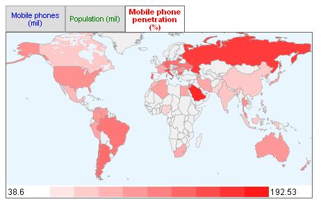
Figure 1: In the Intensity Map, values are represented by the intensity of the colors.
I mentioned earlier that one of the downsides of the Geo Map is its inability to display multiple values in the same chart; well, a quick glance at Figure 1 shows how this chart overcomes that. It's true that the different value representations are not overlapped, which might be confusing; instead, it presents an elegant tabbed display, using one tab for each set of data.
Speaking of data, the information used on this sample program is real and it can be found here.
If you review the source code of the TSTGENINM1 sample program, you'll find that the data comes from a physical file and the P_IntMapRowDS array is loaded using a cycle. Since none of my previous sample programs used files, for simplicity's sake, I decided to do so now. You can use this file, or an adaptation of it, to quickly create your own charts. There are only two details you need to watch out for. First, the country or U.S. state (more on this in the second example) has to follow the ISO country two-letter naming convention or the U.S. state two-letter abbreviation; otherwise, the chart API won't recognize it. Second, be aware of the "size" of the numbers you want to represent; I had to reduce the scale of the population to millions in order for it to fit the CellValue field size. Of course, you can also go to the QCPYLESRC/GENCHRT_PR source member and change the t_CellValue definition to a larger number instead. Just be sure to recompile the GENCHRT service program afterward.
The second sample program (TSTGENINM2) also uses real data, extracted from the Census.gov Web site (more specifically, from here and here), and it took me a bit to reformat it so that the API could identify all 50 states. The resulting chart can be accessed here. Cool, isn't it? I hope these two examples are enough to convince you to add this chart type to your arsenal!
Unfortunately, this chart type doesn't offer much customization. You're limited to a maximum chart size of 440x220 pixels, and the choice of maps only has world, africa, asia, europe, middle_east, south_america, and usa as possible values. The one thing you can have a little bit of fun customizing is the color used in each data tab: by setting the "colors" array in the options, you get to choose the best colors for your data. Be careful; lighter colors don't produce very visible color scales. Always try to use intense colors to make the map scale clear.
You can download the complete source code and data used on the sample programs here and, as usual, I'll be glad to answer any questions you may have. It's the readers' feedback that helps me improve from TechTip to TechTip!
Speaking of TechTips, the next one of this series will explore the Combo Chart.

Rafael Victória-Pereira has more than 20 years of IBM i experience as a programmer, analyst, and manager. Over that period, he has been an active voice in the IBM i community, encouraging and helping programmers transition to ILE and free-format RPG. Rafael has written more than 100 technical articles about topics ranging from interfaces (the topic for his first book, Flexible Input, Dazzling Output with IBM i) to modern RPG and SQL in his popular RPG Academy and SQL 101 series on mcpressonline.com and in his books Evolve Your RPG Coding and SQL for IBM i: A Database Modernization Guide. Rafael writes in an easy-to-read, practical style that is highly popular with his audience of IBM technology professionals.
Rafael is the Deputy IT Director - Infrastructures and Services at the Luis Simões Group in Portugal. His areas of expertise include programming in the IBM i native languages (RPG, CL, and DB2 SQL) and in "modern" programming languages, such as Java, C#, and Python, as well as project management and consultancy.
MC Press books written by Rafael Victória-Pereira available now on the MC Press Bookstore.
 |
Evolve Your RPG Coding: Move from OPM to ILE...and Beyond Transition to modern RPG programming with this step-by-step guide through ILE and free-format RPG, SQL, and modernization techniques. List Price $79.95 Now On Sale
|
|
 |
Flexible Input, Dazzling Output with IBM i Uncover easier, more flexible ways to get data into your system, plus some methods for exporting and presenting the vital business data it contains. Now On Sale
|
|
 |
SQL for IBM i: A Database Modernization Guide Learn how to use SQL’s capabilities to modernize and enhance your IBM i database. Now On Sale
|

 Business users want new applications now. Market and regulatory pressures require faster application updates and delivery into production. Your IBM i developers may be approaching retirement, and you see no sure way to fill their positions with experienced developers. In addition, you may be caught between maintaining your existing applications and the uncertainty of moving to something new.
 IT managers hoping to find new IBM i talent are discovering that the pool of experienced RPG programmers and operators or administrators with intimate knowledge of the operating system and the applications that run on it is small. This begs the question: How will you manage the platform that supports such a big part of your business? This guide offers strategies and software suggestions to help you plan IT staffing and resources and smooth the transition after your AS/400 talent retires. Read on to learn:
LATEST COMMENTS
MC Press Online