


None of the charts I've shown you had the special feature of this one, which allows you to use two or more types of chart together.
On many occasions, a single way of representing values (such as a set of columns, lines, or bars) is not enough to truly get the right message across. If you want to show the evolution of a certain value and simultaneously compare that value with what was planned, the charts I've presented on previous TechTips just won't do.
That's where the Combo Chart API comes in. The combo chart will allow you to show, for example, those bar/line combination charts that the Finance Department people love so much. As the name implies, this chart type allows you to combine up to three different types of charts (columns, lines, and areas) into a single chart. You can go as far as to represent each value of your data set with a different type of chart, or at least, represent it with different characteristics.
As usual, I strongly recommend that you read all the previous TechTips of this series, because each of them adds a little to the global picture, which will help you to get the right mind set for this TechTip. Start with the pie chart and go all the way to the intensity map chart. Naturally, I also advise you to review the API's documentation, because I won't repeat myself by focusing on topics I've covered in previous TechTips. Having said that, let's move on to the template used for this chart, the Combo.tmpl:
/$Header
<!DOCTYPE html PUBLIC "-//W3C//DTD XHTML 1.0 Strict//EN" "http://www.w3.org/TR/xhtml1/DTD/xhtml1-strict.dtd">
<html xmlns="http://www.w3.org/1999/xhtml">
<head>
<meta http-equiv="content-type" content="text/html; charset=utf-8"/>
<title>
/%PageTitle%/
</title>
<script type="text/javascript" src="http://www.google.com/jsapi"></script>
<script type="text/javascript">
google.load('visualization', '1', {packages: ['corechart']});
</script>
<script type="text/javascript">
function drawVisualization() {
// Create and populate the data table.
var data = new google.visualization.DataTable();
data.addRows(/%TotalRows%/);
data.addColumn('string', 'Col1');
/$Column
data.addColumn('number', '/%ColumnTitle%/');
/$FirstRow
data.setValue(/%RowNbr%/, 0, '/%RowTitle%/');
/$Row
data.setValue(/%RowNbr%/, /%ColNbr%/, /%CellValue%/);
/$OptionsBegin
var options = {
/$Option
'/%OptionTitle%/': /%OptionLongValue%/
/$OptionsEnd
};
/$Footer
// Create and draw the visualization.
var ac = new google.visualization.ComboChart(document.getElementById('visualization'));
ac.draw(data, options);
}
google.setOnLoadCallback(drawVisualization);
</script>
</head>
<body style="font-family: Arial;border: 0 none;">
<div id="visualization"></div>
</body>
</html>
It's an almost exact copy of the previous template. However, the Option section is a bit different; the /%OptionValue%/ variable was replaced by an /%OptionLongValue%/ variable. Even though this was not mandatory, I've done it to keep the template variable names in line with the data structure variable names. To explain why a new variable was necessary, I need to explain a bit more about this chart type. As the template hinted, it's a regular two-dimensional table-based chart. However, the trick behind the "combo" is the choice of options: two new keywords—"seriesType" and "series"—will allow you to customize each set of data in multiples ways by specifying attributes that apply only to that subset of values within your set. The OptionValue variable has a length of 100 characters; in some cases, this wouldn't be enough to accommodate the string of attributes for the "seriesType" keyword, so I decided to create the OptionLongValue variable, which has a length of 255 characters. Let me try to make this clearer with a few examples. Imagine that you want the classical column chart with a line indicating the average, like the one Google presents as the example in the chart's documentation:
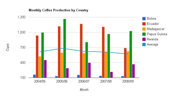
Figure 1: Put a line into your column chart.
Here, the primary chart is a column chart, and the secondary chart is a line chart. To achieve this result, you'd need to specify the following "seriesType" and "series" options:
(…)
seriesType: "bars", series: {5: {type: "line"}}
(…)
As you probably guessed by now, the "seriesType" is used to set the type of chart to be used by default; if you don't specify a different type on the "series" keyword, all the data will be represented using the chart type you defined in the "seriesType" keyword. But for that you wouldn't need the combo chart! The "magic trick" is performed by the "series" keyword. In this example, I'm telling the chart to represent the fifth column of data as a line. Be aware that the count starts at zero instead of one, so the column number 6 is actually the fifth for this keyword; also note that the type attribute for columns (used on the "series" keyword) is actually "bars." If I wanted to specify more attributes for column 5, like color, for instance, I'd just have to add a comma and insert the attribute name and value within the inner brackets.
For complete (and a bit more complex) examples, please review the source code of TSTGENCMB1 and TSTGENCMB2. In these sample programs, I'm combining the three possible chart types and adding some additional keywords and attributes to embellish the final result. There are numerous possibilities, even though not all of them produce good results. My advice is to experiment in the Visualization Playground before using the attributes in your programs.
I provide the complete source code, as usual. You can download it here. As for the next TechTip, my original plan was to present the Geo Chart API, but then I realized that it's nothing more than an updated version of the Geo Map API that I covered in Part 3, without the Flash limitation; it renders the map by using SVG or VML instead. That means you can easily change the GeoMap procedure if you want to use the new API; just read the documentation and compare the examples! Instead, the next TechTip will deal with two less serious and more smile-inducing types of chart, aptly named "Bars of Stuff" and "Piles of Money."

Rafael Victória-Pereira has more than 20 years of IBM i experience as a programmer, analyst, and manager. Over that period, he has been an active voice in the IBM i community, encouraging and helping programmers transition to ILE and free-format RPG. Rafael has written more than 100 technical articles about topics ranging from interfaces (the topic for his first book, Flexible Input, Dazzling Output with IBM i) to modern RPG and SQL in his popular RPG Academy and SQL 101 series on mcpressonline.com and in his books Evolve Your RPG Coding and SQL for IBM i: A Database Modernization Guide. Rafael writes in an easy-to-read, practical style that is highly popular with his audience of IBM technology professionals.
Rafael is the Deputy IT Director - Infrastructures and Services at the Luis Simões Group in Portugal. His areas of expertise include programming in the IBM i native languages (RPG, CL, and DB2 SQL) and in "modern" programming languages, such as Java, C#, and Python, as well as project management and consultancy.
MC Press books written by Rafael Victória-Pereira available now on the MC Press Bookstore.
 |
Evolve Your RPG Coding: Move from OPM to ILE...and Beyond Transition to modern RPG programming with this step-by-step guide through ILE and free-format RPG, SQL, and modernization techniques. List Price $79.95 Now On Sale
|
|
 |
Flexible Input, Dazzling Output with IBM i Uncover easier, more flexible ways to get data into your system, plus some methods for exporting and presenting the vital business data it contains. Now On Sale
|
|
 |
SQL for IBM i: A Database Modernization Guide Learn how to use SQL’s capabilities to modernize and enhance your IBM i database. Now On Sale
|

 Business users want new applications now. Market and regulatory pressures require faster application updates and delivery into production. Your IBM i developers may be approaching retirement, and you see no sure way to fill their positions with experienced developers. In addition, you may be caught between maintaining your existing applications and the uncertainty of moving to something new.
 IT managers hoping to find new IBM i talent are discovering that the pool of experienced RPG programmers and operators or administrators with intimate knowledge of the operating system and the applications that run on it is small. This begs the question: How will you manage the platform that supports such a big part of your business? This guide offers strategies and software suggestions to help you plan IT staffing and resources and smooth the transition after your AS/400 talent retires. Read on to learn:
LATEST COMMENTS
MC Press Online