"I am a design chauvinist. I believe that good design is magical and not to be lightly tinkered with. The difference between a great design and a lousy one is in the meshing of the thousand details that either fit or don't, and the spirit of the passionate intellect that has tied them together, or tried. That's why programming--or buying software--on the basis of 'lists of features' is a doomed and misguided effort. The features can be thrown together, as in a garbage can, or carefully laid together and interwoven in elegant unification, as in APL, or the Forth language, or the game of chess."
--Ted Nelson, the founding father of "hypertext"
As we really begin to make headway into the new millennium, I thought it was appropriate to reflect on the state of software development. There seems to be a body of thought within our industry that insists that programming will soon be little more than plugging together off-the-shelf components...if, indeed, it hasn't already reached that point. I think that's absolute hogwash, and Mr. Nelson's quote points out why.
Computer programming is about design, innovation, and creation. It's about taking simple constructs and making complex representations of even more complex ideas. It is truly making something out of nothing. Those who approach programming with this intent are the ones who actually design solutions for their employers or their clients. These people are not in it so much for the money as for the ability to create, and they need their tools to work for them, rather than the other way around.
WDSc and Its Web Design Tools
And that's where we tie back into WebSphere--specifically, WebSphere Development Studio Client for iSeries (WDSc) and its Web design tools. WDSc provides a wealth of tools, more than you might expect. This is especially true for those of us who come to the tool as an SEU replacement. We're perhaps less likely to even know about--much less actually try--some of the more advanced features of Web design that WDSc offers. In this article, I'll review many of those features and show how the WDSc implementation allows developers to be as creative as they desire.
I'll cover...
- The Page Designer (HTML and JSP)
- The Web Site Designer
- The CSS Designer
- The WebArt Designer
All of these pieces are inherited from the WebSphere Studio Site Designer (WSSD), upon which WDSc is built. That's perhaps part of the reason we in the green-screen world don't know about them; the Web development pieces are taken for granted by the GUI developers, whereas we green-screeners tend to focus on the iSeries extensions. The many wonderful features of WSSD sometimes get lost in the shuffle. This column will bring them to your attention.
Because these features are also included in WebSphere Studio Application Designer (WSAD), the product underlying WDSc Advanced Edition, they're all available regardless of which version of WDSc you use.
The Page Designer (HTML)
WDSc's Page Designer is quite a tool. It includes many of the features of high-end HTML editors like Macromedia's Dreamweaver but all within the basic framework of the WDSc workbench.
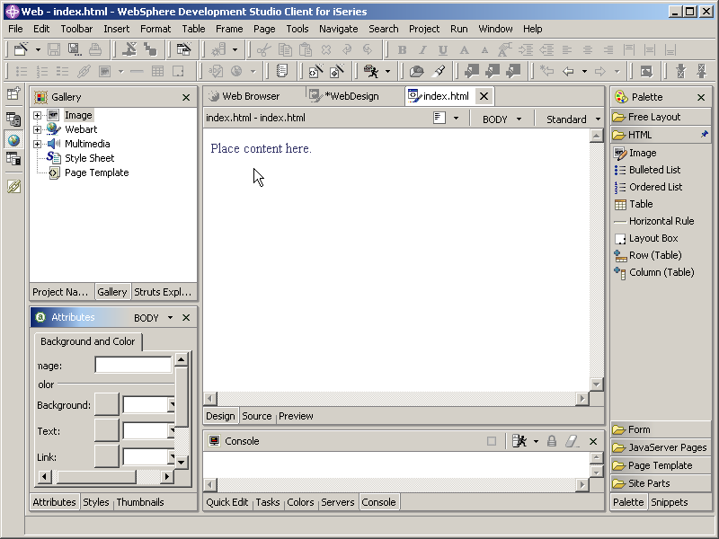
Figure 1: HTML design is one of several tasks done within the basic Web development perspective. (Click images to enlarge.)
In Figure 1, you can see that, like most WDSc features, the HTML editor is made up of a number of "views" all joined into a "perspective." The primary view is the editing view right in the middle of the workbench. It has three distinct modes, which are accessible via the tabs along the bottom of the view. Design mode, which is the one shown, allows WYSIWYG editing of the page. Source mode provides direct access to the underlying source, while Preview mode allows you to see the final image of the page, including animations and JavaScript.
Other views include the Gallery on the upper left, which allows the inclusion of images and other types of Web components. Selecting a folder in the Gallery will display the contents as thumbnails in the lower left panel. That lower left panel has other uses, too. As shown, it is providing the properties for the selected component in the editing view. In this case, since nothing is selected, the panel is showing the properties for the tag in a context-sensitive wizard that you can use to modify any of the tag's attributes. Which wizard is shown depends on what is highlighted in the editing panel.
The panel on the right is even more handy. This view, called the "Palette." provides an easy way to add pre-defined widgets of all types to your page. The Palette is broken up into drawers, which you can open and close as needed to provide access to the widgets in each one. The HTML drawer is shown in Figure 1, with icons for lists and tables among other things. A simple drag-and-drop technique will bring up a wizard for the selected widget and then place the configured widget on the page.
There is also a "snippets" view that provides access to icons that add either JavaScript functions or custom tags. Many of these come close to the capabilities of Dreamweaver functions, such as creating a rollover image. Also, like just about everything in WDSc, you can actually create your own snippets.
The Page Designer (JSP)
And while the HTML mode of Page Designer is very nice, the JavaServer Page (JSP) mode is even nicer. If you think of a JSP as an HTML page with some extra directives and the ability to add Java code, then you might guess that a JSP design tool should have all the features of HTML design plus support for JSP-specific directives and Java code. And in the case of WDSc, you would be correct.
What I particularly like about the JSP mode of Page Designer is the fact that it provides complete Java syntax checking in the midst of your JSP. This means checking the actual syntax of your code but also allowing many of the capabilities of the standard Java editor, including code completion and code repair suggestions. Figure 2 shows a simple case of the designer complaining about a bug in my code.
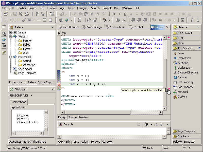
Figure 2: When editing a JSP in the Page Designer, standard Java syntax checking is in force.
The Web Site Designer
One of the best things about Microsoft FrontPage was how easy it made creating Web sites. You could just add page after page after page, and FrontPage would track everything for you, to the point of creating nice navigation bars for everything. The UI was a little crude especially in the early days of FrontPage. It was often pretty obvious that a site had been created with FrontPage (I'm not being critical; my old Java/400 site was created with FrontPage, and it served its purpose--until my ISP got hacked).
WDSc has that covered. You can add pages to your Web site and then rearrange them to your heart's content. You can even identify certain pages to either be part of or not part of the standard navigation and site map capabilities of the designer (which I'll talk about in a moment). One of my favorite things is that the Web Site Designer allows you to switch the orientation of the Web diagram. Figure 3 shows the same simple Web site in booth modes. I find the second mode easier to deal with, especially as my Web site gets more complex.

Figure 3: You can show the layout of your Web in either orientation.
The other nice thing about FrontPage was that you could assign a style to your pages. This style would affect the background of your page, as well as things like fonts and button images and the like. If you got tired of a given style, you could easily change it, and FrontPage would regenerate the screens for you. But it was rather limited in what was actually changed by the style.
WDSc takes that concept to a whole new level. In WDSc, you can assign a "template" to a Web page. The template is in effect a shell of non-changeable information (or almost non-changeable, a qualification I'll elaborate upon shortly). This shell is included on every page that the template is assigned to. If needed, you can apply a different template to different pages within your Web site or even change the template for all your pages at once. A number of predefined templates come along with the tool; these templates provide things like logos and navigation bars. Let me show you what happens to my little sample Web site when I apply a standard template.
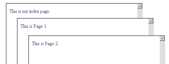
Figure 4: These are my three pages. Not much there, right? Now, I add a template.
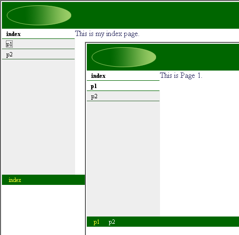
Figure 5: This is the same Web site, the only alteration being the application of a template.
By simply applying a template, the pages now take on a new, stylized life with a consistent look and feel as well as ready-made navigation capabilities. Figures 4 and 5 show the before and after of the application of the template, and as an MC Mag Online exclusive, we're including an MC Clip, a video that shows you the entire process. This is our first video clip, and we'd love your feedback. As our pilot, we're making the clip available as a zipped MPEG file: Download the zip file (it's 7 MB long), and inside you'll find the video clip in MPEG format. Please let us know if you'd like to see more videos and if this is a compatible format for you.
The entire template concept was done with tremendous forethought, in my opinion. Website requirements change, and in order to address that, WDSc templates are not static objects. Instead, when you apply a template, that template is then copied into your folder. You can now make changes to the template using WDSc's HTML editor, and any changes you make to the template are then automatically reflected in all your pages.
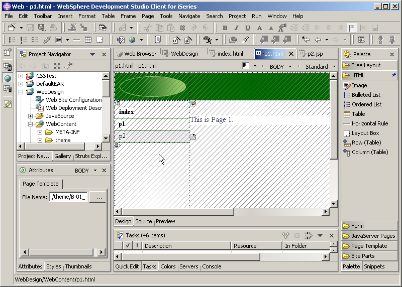
Figure 6: When you edit a page with an attached template, you cannot change the template-derived code.
The editor is astonishingly intelligent. As shown in Figure 6, when you edit a page that has a template attached, the area that is "controlled" by the template is disabled. The cross-hatching indicates that this area is not editable. The only areas editable are those under your control. This same feature is carried into the editor. The only negative of the entire process is that it can occasionally be a little frustrating to try to separate editable and non-editable portions in the editor. If you run into this issue, drop me an email and I'll try to explain how I get around the problem. It's not very intuitive, and it doesn't always work, so I hesitate to include the technique in this article.
As usual, I am just scratching the surface of the capabilities of these tools. But there is one thing I have to bring to your attention, which is the scripting language used for the navigation widgets. Somehow, the template software figured out how to generate the appropriate navigation code; the "somehow" is the scripting language. I'm including the code that generates the side navigation bar in my template. I don't have the space to explain this remarkable bit of code, but I wanted to include it to illustrate that the navigation widgets are entirely user-editable. The biggest problem is that there is absolutely zero documentation for the scripting language. I had to figure it out by trial and error. You can see an example of a highly customized set of navigation widgets by checking out my Web site.
The CSS Designer
The CSS Designer is a feature that is unique to WDSc in my experience. Other HTML editors may have a similar function, but I haven't seen any done this well. This may be one of the best applications of wizard technology that I've ever used. CSS is a very powerful but somewhat arcane text-based definition language, and it's easy to make syntax mistakes that are difficult to identify and diagnose. With the CSS designer, much of the drudgery is removed, and errors are reduced by the WYSIWYG nature of the editor.
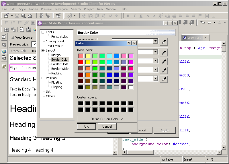
Figure 7: The CSS Designer uses intuitive wizards to edit your styles within a decent WYSIWYG interface.
Figure 7 shows the CSS Designer expanded to the entire workbench (a standard capability of all WDSc views, since this is a base feature of the Eclipse framework), as well the wizard that allows you to edit a style. As you can see, the wizard itself has "sub-wizards" that make it easy to edit individual properties of the style; in this case, a color chooser has been invoked that allows me to specify the border color for this style. Similar sub-wizards are available for all of the attributes associated with styles, so you can do most of your CSS design by pointing and clicking.
The WebArt Designer
The WebArt Designer is something I hadn't expected to see within WDSc. I use several packages for image design, capture, and conversion, including Xara X and Paintshop Pro. The various packages each have their own capabilities, and given the complexity of some of these capabilities, I simply thought they were beyond the scope of WDSc. I was wrong. While the dedicated packages each have features unique to the package, the WebArt Designer in WDSc does a great job of providing a basic set of features that is enough to do most of what is needed for a typical Web site. I suppose that certain sites might need a more robust tool, but so far I haven't, and my Web site has a fair amount of graphics.
Note that the WebArt Designer isn't quite as integrated into the WDSc workbench. It comes up in its own window, as shown in Figure 8.
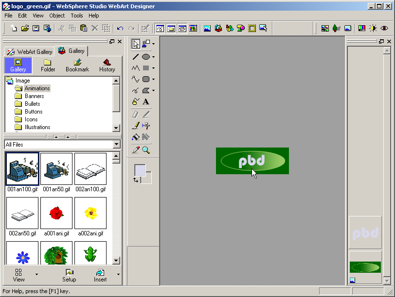
Figure 8: Invoking the WebArt Designer starts up a new dedicated window.
The beauty of the WebArt Designer lies in its "object oriented" approach. The standard image type is a ".mif" file, WebArt Designer's own internal format. Within this format, you can build an image up out of shapes, text, images, whatever you'd like. As long as you save the file in the .mif format, you can always go back and tweak the individual components of the image to get the look you want. Then, once you've created the image, you can save the file as one of several industry standard formats, such as .gif, .png, or .bmp. This is more of an export function; I don't like the "save" terminology, because if you forget and save as an external format and don't save the .mif representation, you will not be able to go back in and modify components individually.
That quibble aside, I found the tool very easy to use, and I was able to modify the logo image for my Website and add text in just seconds, as shown in figure 9.

Figure 9: Adding text to an image is easy in WebArt Designer.
And as if this weren't enough, somebody at IBM even had the presence of mind to include a simple but functional animated .gif creator. While I'm not a fan of animated .gif files, they are sometimes useful, and the tool included in WDSc is sufficient for those cases when I've found animation necessary.
Kudos
It's not hard to sense my enthusiasm for the WSSD portion of WDSc. The integration of the workbench is simply fantastic. The syntax checking of the Java code within a JSP is exactly the sort of thing that indicates to me that the product was designed by people with real development backgrounds, people who understand what is required and what is not in an application development tool.
There are a couple of rough edges, but the ones I've found are quite minor. Having developed projects of this nature, I find the defect rate for this part of the tool is astonishingly low. I have seen products with far fewer features plagued with far more bugs. Given what WDSc does, the product is worth many hundreds of dollars, if not a couple of thousand.
And we get it for free. It's good to be an iSeries developer!
Joe Pluta is the founder and chief architect of Pluta Brothers Design, Inc. He has been working in the field since the late 1970s and has made a career of extending the IBM midrange, starting back in the days of the IBM System/3. Joe has used WebSphere extensively, especially as the base for PSC/400, the only product that can move your legacy systems to the Web using simple green-screen commands. Joe is also the author of E-Deployment: The Fastest Path to the Web and Eclipse: Step by Step. You can reach him at


 Business users want new applications now. Market and regulatory pressures require faster application updates and delivery into production. Your IBM i developers may be approaching retirement, and you see no sure way to fill their positions with experienced developers. In addition, you may be caught between maintaining your existing applications and the uncertainty of moving to something new.
 IT managers hoping to find new IBM i talent are discovering that the pool of experienced RPG programmers and operators or administrators with intimate knowledge of the operating system and the applications that run on it is small. This begs the question: How will you manage the platform that supports such a big part of your business? This guide offers strategies and software suggestions to help you plan IT staffing and resources and smooth the transition after your AS/400 talent retires. Read on to learn:
LATEST COMMENTS
MC Press Online