The current incarnation of the web-styling language CSS provides some nice and simple-to-implement animation capabilities.
The current incarnation of the web-styling language CSS provides animation capabilities that hitherto were only available in JavaScript or the third-party software known as Flash. The Apple brand mobile devices will not run Flash, and not all Androids run it either. Enter CSS3 animation; Flash is dead!
Why Animate?
In today's world, more people access the Internet via their mobile devices than from desktop PCs. The paucity of screen real estate on a mobile device demands the economic use of the available space. Through the use of animation, additional content such as a navigation menu can slide in and overlay the current page content.
Animation can be used to bring the user's attention to particular elements on a page. And animation, when used wisely, gives the site a slick and professional appearance.
As more and more companies that use the IBM i modernize their applications by rendering them to the browser, animation will come into our world.
This article will guide you through creating animations that will execute on our preferred server.
The Basics of CSS Animation
There are directives in CSS3 known as Transforms, which, as the name suggests, transform an element from its original state to another form. These transforms are Skew, Rotate, Scale, and Translate. The name of the latter (Translate) is a little ambiguous and is really just a "move."
In addition to Transforms, there are timing directives known as Keyframes (coded as @keyframe). Keyframes define the timing of the animation and can additionally include other element style changes— for example, the background color—at particular points in the animation.
The original, named element and the Keyframe combine to effect the animation.
An Animation Example
Our example is a square defined using the HTML tag <Fieldset>, viz:
<fieldset>
<pre><br><br>
Hello Animation!
</pre>
</fieldset
This is the CSS styling:
fieldset {
background-color:#000080;color: #ffffff;
text-align:center;
width:200px;height:200px;
font-size:1.5em;
position: relative;top:-25px;
margin:25px;
}
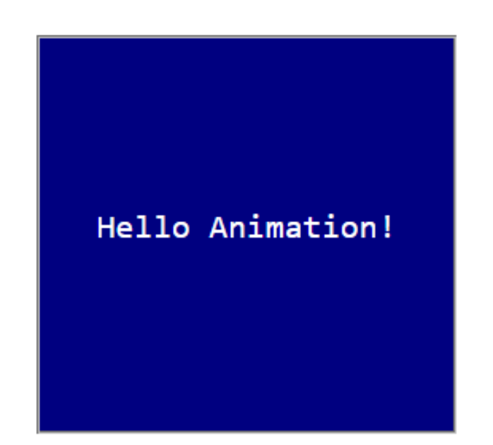
The code gives the following rendering:

Figure 1: Note the blue background and the square corners.
An Example Using the Skew Transform
The first example will skew the element. To do this, we add the element definition to the animation directives:
fieldset {
background-color:#000080;color: #ffffff;
text-align:center;
width:200px;height:200px;
font-size:1.5em;
position: relative;top:-25px;
margin:25px;
animation-name: animation;
animation-duration: 8s;
animation-delay: 2s;
}
This code names the animation as "animation1." It will run for 8 seconds and has a delayed start of 2 seconds.
The keyframe definition would look as follows:
@keyframes animation {
from { }
to { transform: skew(15deg,20deg); }
}
The key frame has a simple "from" and "to" specification. No styling elements will be changed at start, but the element will be skewed over a period of 8 seconds, where the X-axis skew is 15 degrees and the Y-axis is 20 degrees. (There are two other related transforms—SkewX and SkewY—where only one parameter is specified.)

Figure 2: Click to run the animation.
The example above is a simple case, and the keywords "from" and "to" have been used. An animation usually goes through several changes throughout its duration, so typically percentages are used. A three-step @keyframe might look as follows:
@keyframes animation {
0% { }
50% { transform: skew(15deg,20deg); }
100% { transform: skew(30deg,40deg); }
}
Vendor Prefixes
A small drawback in CSS3 animations is that the renderings are browser-specific. This forces us to declare the browser we want the animation to run on within the CSS element specification and the @keyframe specification. Otherwise, the animation won't work.
For each CSS3 style specification that includes a transform and for each @keyframe specification, we need to include a vendor prefix. So our code really needs to look as follows to run on all of the popular browsers:
fieldset {
background-color:#000080;color: #ffffff;
text-align:center;
width:200px;height:200px;
font-size:1.5em;
position: relative;top:-25px;
margin:25px;
-webkit-animation-name: animation;
-webkit-animation-duration: 8s;
-webkit-animation-delay: 2s;
-ms-animation-name: animation;
-ms-animation-duration: 8s;
-ms-animation-delay: 2s;
-moz-animation-name: animation;
-moz-animation-duration: 8s;
-moz-animation-delay: 2s;
-o-animation-name: animation;
-o-animation-duration: 8s;
-o-animation-delay: 2s;
}
Where –webkit- represents Chrome and Safari
-ms- Microsoft's Internet Explorer
-moz- FireFox
-o- Opera.
Similarly, we need to include the vendor prefixes on the @keyframe tags:
@-webkit-keyframes animation {
from {}
to { transform: scale(0.5); }
}
@-ms-keyframes animation {
from {}
to { transform: scale(0.5); }
}
@-moz-keyframes animation {
from {}
to { transform: scale(0.5); }
}
@-o-keyframes animation {
from {}
to { transform: scale(0.5); }
}
For sure, this is an annoyance that we have to deal with, and it makes the scripts containing animations unnecessarily verbose in my opinion. Animation directives without a prefix work only for IE, but not all directives work on early versions of IE.
For the benefit of this article, the examples below omit the vendor prefixes but they will be included in the source code of the demonstration scripts.
An Example Using the Rotate Transform
Leaving the basic CSS element unchanged, the @keyframe would look as follows:
@keyframes animation {
from {}
to { transform: rotate(45deg); }
}

Figure 3: Click to run the animation.
An Example Using the Scale Transform
Leaving the basic CSS element unchanged, the @keyframe would look as follows:
@keyframes animation {
from {}
to { transform: scale(0.5);}
}
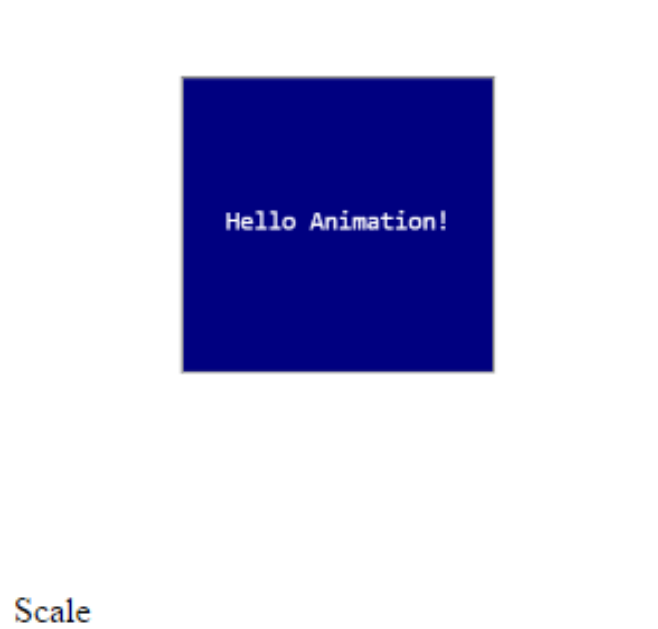
The animation shrinks the element to 50% of its original size.

Figure 4: Click to run the animation.
An Example Using the Translate Transform
Leaving the basic CSS element unchanged, the @keyframe would look as follows:
@keyframes animation {
from {}
to { transform: translate(600px,-50px); }
}
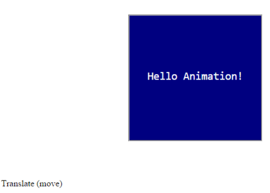
The animation moves the element to 600 pixels to the right and 50 pixels up from its initial position.

Figure 5: Click to run the animation.
Multiple Animations
Not surprisingly, we can combine transforms to create more-complex animations. In this example, 100% is used instead of the keyword "To".
Example:
100% { transform: skew(15deg,20deg)
rotate(45deg)
scale(0.5)
translate(300px,-50px)
}
Style Changes During Animations
In addition to specifying animation directives, the @keyframe can also specify style changes to the element. In the following @keyframe example, the animation has been changed to have three states, and halfway through (at 50%), the element's corners will be rounded and the background color will change. In the final step of the animation (at 100%), the corners are further rounded and the background color changes again.
@keyframes animation {
0% {
}
50% {
border-radius:25% 25% 25% 25%;
background-color:008800;
transform: skew(7.5deg,10deg)
rotate(22deg)
scale(0.75)
translate(150px,-25px)
}
100% {
background-color:880000;
border-radius:50% 50% 50% 50%;
transform: skew(15deg,20deg)
rotate(45deg)
scale(0.5)
translate(300px,-50px)
}
}
Additional Transforms
There are some additional Transforms that can be used to great effect.
This directive causes the animation to play continuously:
animation-iteration-count: infinite;
This directive causes the animation to play from start to finish and back again:
animation-direction: alternate;
This directive causes the animation to start slowly, accelerate to normal speed, and then slow down again as the animation approaches the end:
animation-timing-function: ease-in-out;
Other values for this directive are ease-in, ease-out, and cubic-bezier. The latter is a means whereby you can define your own timing function.
By adding these transforms to our original element, we get this:
fieldset {
background-color:#000080;color: #ffffff;
text-align:center;
width:200px;height:200px;
font-size:1.5em;
position: relative;top:-25px;
margin:25px;
animation-name: animation;
animation-duration: 8s;
animation-delay: 2s;
animation-direction: alternate;
animation-iteration-count: infinite;
animation-timing-function: ease-in-out;
}
After incorporating these additional directives, we get a more-sophisticated animation:

Figure 6: Click to run the animation.
Animate!
As you can see, including animation in your web pages isn't difficult. Although the examples contained herein are all flat HTML files, CGI programs written in RPG can easily produce the same result. The animations addressed in this article are all two-dimensional, but CSS3 has the ability to render three-dimensional animation, which can be used, say, to rotate images of products 360 degrees. But we'll save that discussion for another day.
Finally, don't forget the vendor prefixes in your code to ensure that your animation works with all the browsers.


 Business users want new applications now. Market and regulatory pressures require faster application updates and delivery into production. Your IBM i developers may be approaching retirement, and you see no sure way to fill their positions with experienced developers. In addition, you may be caught between maintaining your existing applications and the uncertainty of moving to something new.
 IT managers hoping to find new IBM i talent are discovering that the pool of experienced RPG programmers and operators or administrators with intimate knowledge of the operating system and the applications that run on it is small. This begs the question: How will you manage the platform that supports such a big part of your business? This guide offers strategies and software suggestions to help you plan IT staffing and resources and smooth the transition after your AS/400 talent retires. Read on to learn:
LATEST COMMENTS
MC Press Online