What’s for dinner, Mum? Grids and tables, son.
Ever since I started to write HTML many years back, tables have been around. For all these years, we’ve seen articles and books that claim tables will go away and be replaced by something smarter and more flexible, but to this day tables live on and are widely used around the web.
Why are they still around? Well, I guess they just get the job done in a fast and efficient way, and there’s not much fuss to get into them.
They are also supported in Bootstrap version 3, and the same applies to the alpha version 4.
Let’s look at a table example.
<!DOCTYPE html>
<html lang="en">
<head>
<title>MCpressonline.com -> Bootstrap part 2 - Tables Normal Example</title>
</head>
<body>
<h3>This is a "normal" table, no Bootstrap</h3>
<table border="1" cellpadding="5" cellspacing="0">
<tr bgcolor="#cccccc">
<td colspan="4">
<b>The three five Elvis Costello singles</b>
</td>
</tr>
<tr bgcolor="#e8e8e8">
<td>A-side</td>
<td>B-side(s)</td>
<td>Released</td>
<td>More info</td>
</tr>
<tr>
<td>Less Than Zero</td>
<td>Radio Sweetheart</td>
<td>25 March 1977</td>
<td><a href="https://en.wikipedia.org/wiki/Less_Than_Zero_%28song%29" target="_blank">Wiki Link</a></td>
</tr>
<tr>
<td>Alison</td>
<td>Welcome to the Working Week</td>
<td>21 May 1977</td>
<td><a href="https://en.wikipedia.org/wiki/Alison_%28Elvis_Costello_song%29" target="_blank">Wiki Link</a></td>
</tr>
<tr>
<td>Red Shoes</td>
<td>Mystery Dance</td>
<td>07 Jul 1977</td>
<td></td>
</tr>
</table>
</body>
</html>
This code will look like the table in Figure 1.
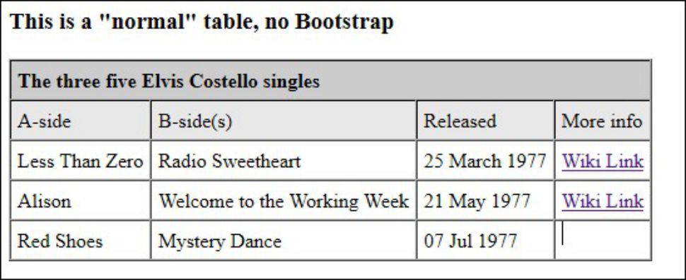
Figure 1: This table example has no bootstrap.
As you see, I have created a simple table, using a little background color and some straightforward HTML tagging. The table shows a listing of the three first singles Mr. Costello released, and there’s even a link to give you more information if want; it’s not all about programming!
Bootstrap version 3 deals with tables as it deals with anything else, by using classes. So let’s Bootstrap this table by adding the .table class and removing all the other HTML attributes used. The new code is shown below. (Note: I have included only the code that was changed; all the details are still the same and have not been changed in any way.)
<!DOCTYPE html>
<html lang="en">
<head>
<title>MCpressonline.com -> Bootstrap part 2 - tables</title>
<meta charset="utf-8">
<meta name="viewport" content="width=device-width, initial-scale=1">
<link rel="stylesheet" href="/bootstrap/css/bootstrap.min.css">
<script src="/bootstrap/js/bootstrap.min.js"></script>
</head>
<body>
<div class="container">
<h3>Same table but now bootstrapped</h3>
<table class="table table-bordered table-striped table-hover">
<thead>
<tr style="background-color:#cccccc">
<td colspan="4">
<b>The three first Elvis Costello singles</b>
</td>
</tr>
<tr style="background-color:#e8e8e8">
<td>A-side</td>
<td>B-side(s)</td>
<td>Released</td>
<td>More info</td>
</tr>
</thead>
<tbody>
Table data goes here
</tbody>
</table>
</div>
</body>
</html>
As you see, I removed all the HTML table attributes and added some classes. The added classes are:
- .table will turn the table into a Bootstrap table
- .table-bordered will add borders to the table
- .table-striped will add on/off grayscale colors to the rows
- .table-hover will make a hover effect when you move the mouse down the table data
I have added all of the table classes Bootstrap provides, but you can play around to see the different results when removing the different classes.
I have changed the bgcolors to inline CSS just to show you that you can combine it with Bootstrap.
Note that I have added the <thead> and <tbody> to the table. Bootstrap uses this in the hover and stripe effect.
It’s a good idea to have these tags in your table in case you would like to add some sorting to your table using a jQuery plugin or likewise.
The change of data now results in a table that looks like this:

Figure 2: This Bootstrapped table has various table classes applied.
You can also add some kind of responsiveness to a table by embedding the table in a <div> tag with the class .responsive. This will not make the table truly responsive but will add a vertical scrollbar when looking on a small display. You can add the <div class=”responsive”> and resize the browser window to see the result.
Let’s move on to the grid now.
Tables are brilliant to show tabular data, but they are not so good when doing layout, and that is where the Bootstrap grid system kicks in. It provides truly responsive methods to create a nice and good-looking layout that will fit on all devices.
When I first read about it, I did not understand a thing, but I found some examples on the ‘net and played around. I think I understand it now, and I will try to share this knowledge with you.
Can you count to 12? Perfect! You are now on your way. The Bootstrap grid system is all about counting to 12. You have 12 columns across, and within these 12 columns, you can divide them in any pieces you like. This is done by using the “col-xx-n” class. The n is a number between 1 and 12. The xx is where the responsiveness is because you have the following .col classes:
- .col-xs: Extra small devices/phones (<768px)
- .col-sm: Small devices/tablets (?768px)
- .col-md: Medium devices/desktops (?992px)
- .col-lg: Large devices/desktops (?1200px)
With this you can create a simple and effective grid system.
Remember that Bootstrap always goes from small to large in its design. Also remember that the grid must always be specified within a “container” (fixed width) or “container-fluid” (full width).
So with these basic rules, let’s see an example of a grid layout.
Note that I have added some background colors to each data cell to make the grid stand out a little better.
<!DOCTYPE html>
<html lang="en">
<head>
<title>MCpressonline.com -> Bootstrap part 2 - Bootstrap Grid System</title>
<meta charset="utf-8">
<meta name="viewport" content="width=device-width, initial-scale=1">
<link rel="stylesheet" href="/bootstrap/css/bootstrap.min.css">
<script src="/bootstrap/js/bootstrap.min.js"></script>
</head>
<body>
<div class="container">
<h3>Bootstrap Grid System - example 1</h3>
<div class="row">
<div class="col-xs-4" style="background-color: #32B311"><h3>Row 1 / Data 1</h3></div>
<div class="col-xs-4" style="background-color: #DB843D"><h3>Row 1 / Data 2</h3></div>
<div class="col-xs-4" style="background-color: #D52B1E"><h3>Row 1 / Data 3</h3></div>
</div>
<div class="row">
<div class="col-xs-4" style="background-color: #3D96AE"><h3>Row 2 / Data 1</h3></div>
<div class="col-xs-4" style="background-color: #AA4643"><h3>Row 2 / Data 2</h3></div>
<div class="col-xs-4" style="background-color: #B8CCE4"><h3>Row 2 / Data 3</h3></div>
</div>
</div>
</body>
</html>
This code will result in something like this:

Figure 3: This is a Bootstrap grid example on a large screen.
If you resize to a mobile size, it will look like this:
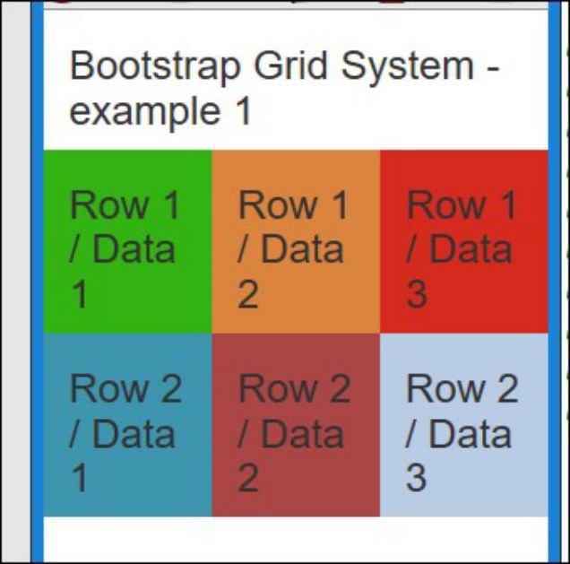
Figure 4: This Bootstrap grid example is for a mobile-sized screen.
So let’s try to build some true responsiveness into the grid.
Let’s say that we want to have 4,4,4 columns on a mobile device, 5,2,5 on a tablet device, and 1,1,10 on row1 and 10,1,1 on row 2 on a large screen. The code will look like this:
<div class="container">
<h3>Bootstrap Grid System - example 2</h3>
<div class="row">
<div class="col-xs-4 col-sm-5 col-lg-1" style="background-color: #32B311"><h3>Row 1 / Data 1</h3></div>
<div class="col-xs-4 col-sm-2 col-lg-1" style="background-color: #DB843D"><h3>Row 1 / Data 2</h3></div>
<div class="col-xs-4 col-sm-5 col-lg-10" style="background-color: #D52B1E"><h3>Row 1 / Data 3</h3></div>
</div>
<div class="row">
<div class="col-xs-4 col-sm-5 col-lg-10" style="background-color: #3D96AE"><h3>Row 2 / Data 1</h3></div>
<div class="col-xs-4 col-sm-2 col-lg-1" style="background-color: #AA4643"><h3>Row 2 / Data 2</h3></div>
<div class="col-xs-4 col-sm-5 col-lg-1" style="background-color: #B8CCE4"><h3>Row 2 / Data 3</h3></div>
</div>
</div>
As you see, I have now used the col-sm- and col-lg- and applied the numbers as written above. This will create grids that look like the ones in Figures 5, 6, and 7.
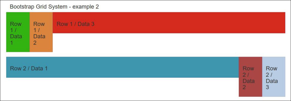
Figure 5: Here’s the grid on a large screen.
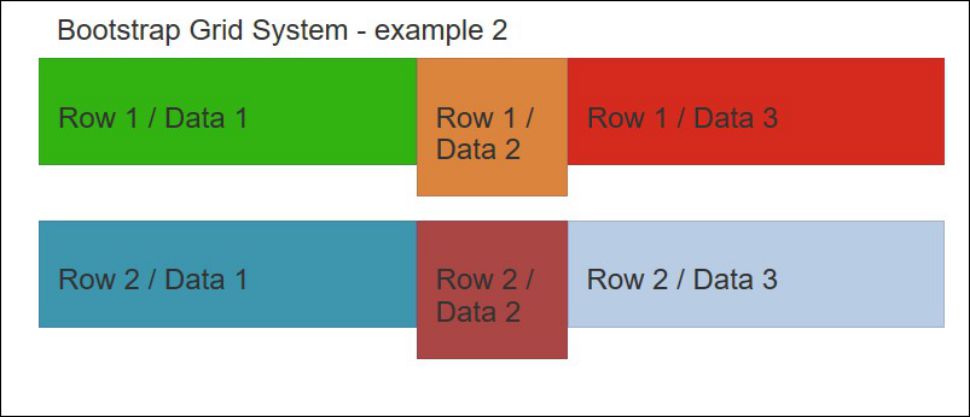
Figure 6: Here’s the grid on a tablet-sized screen.
On a mobile device, the grid will still look like the one in Figure 4, and I do not see any reason to show it again.
But as you see, the rows do not really look that great. Wouldn’t it be nice if the rows were aligned in height? Bootstrap does not have any support for that, but luckily there are some very clever people out there on the Internet. On http://getbootstrap.com.vn/examples/equal-height-columns/, I found all the CSS that is needed to do the trick. I have included it in the download link at the bottom of this article, and I have put it into a new folder called CSS with a member called custom.css.
The new custom-made call is called row-eq-height, and when custom.css is included in the source and the row-eq-height class is added to the <div class=”row”>, the grid will look like this:
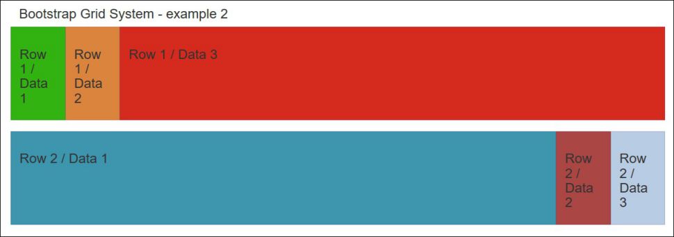
Figure 7: The grid looks like this with row-eq-height applied on a large screen.
Pretty cool, if you ask me.
The grid has landed. I have now shown you the very basic in the Bootstrap grid system, and I hope it is enough to get you started.
Of course, I have not covered every aspect of the subject, but point your browser here:
http://getbootstrap.com/css/#grid
http://www.w3schools.com/bootstrap/bootstrap_grid_system.asp
These links cover things like nesting columns, and offsetting columns, and a lot more.
Or go to YouTube and search for “Bootstrap grid” to find all kind of videos that explain the grid system. Some of them are very good (not as good as my description of course), and some are just bad, but I am sure you will find something that suits you just perfectly.
What’s next? In the next article, which will be the last in the Bootstrap series, I will add buttons, input fields, and some AJAX and combine it with the grid system to show you in a pretty layout some info about Mr. Costello you did not know before.
Till then, may the grid be with you.
Click here to download all the code used in this article.


 Business users want new applications now. Market and regulatory pressures require faster application updates and delivery into production. Your IBM i developers may be approaching retirement, and you see no sure way to fill their positions with experienced developers. In addition, you may be caught between maintaining your existing applications and the uncertainty of moving to something new.
 IT managers hoping to find new IBM i talent are discovering that the pool of experienced RPG programmers and operators or administrators with intimate knowledge of the operating system and the applications that run on it is small. This begs the question: How will you manage the platform that supports such a big part of your business? This guide offers strategies and software suggestions to help you plan IT staffing and resources and smooth the transition after your AS/400 talent retires. Read on to learn:
LATEST COMMENTS
MC Press Online